Thursday, 17 September 2015

Magazine Layout


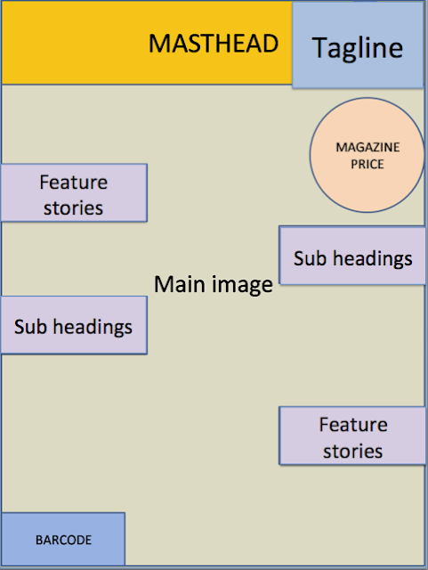
Typical Magazine Cover Layout 


In a typical magazine cover the mast head is placed at the top of the magazine. This makes it stand out as this is the first place you would typically look at. In the middle you would have a main image, typically a model. This makes the magazine look more interesting and visually more appealing. The main image is normally a mid shot as this shows off the model, and makes the model stand out which is what draws the reader in. around the edge of the magazine you would find your sub headings. These let the readers know what’s inside the magazine. Depending on the tag line the writing will normally be different sizes as this makes the more important one stand out and draws the reader in. This will normally be about a famous person. The barcode is located at the bottom typically in the corner. This is so that the consumer is able to buy the product and it is usually small so as not to take up too much space.


Wednesday, 16 September 2015

Connotation and Denotation

Connotation and Denotation


Denotation is what the audience can see. For example there is a red heart.


Connotation is what the meaning of the object is. For example red symbolises power and the heart symbolises love, so a red heart could symbolise powerful love.

Audience Theories


Audience Theories 


There are three different theories of audience that we can apply to help us come to a better understanding about the relationship between texts and the audiences. These theories include - The Effects model or the Hypodermic model, The Uses and gratifications model and the Reception theory.


The old theory – the Hypodermic model – suggest that the message in media texts is ‘injected’ into the audience by the powerful ‘syringe’ like media. Therefor the media is thought to work like a ‘drug; and therefore makes the audience ‘addicted’. The audience however is powerful enough to resist. The newer theory – The Effects model – suggest that the consumption of media text has an effect or influence on the audience, and that it’s normally considered that this effect is negative. The audiences are passive and powerless to prevent the influence and the power lies within the message of the text.


The second theory is The Uses and gratifications model. This theory is the complete opposite to the effects model. This model suggests that the audience is active, and that the power lies with the audience and not with the producers. So instead of the audience being ‘drugged’ by the text, like the hypodermic model suggest, we as the audience are free to reject, use/play with the meanings as they seem fit. Audiences therefor use media texts to gratify needs for, diversion, escapism, information, pleasure, relationships and sexual stimulation. By the audience being it control it allows the audience to deal with issues such as, learning, emotional satisfaction, relaxation, personal identity, social identity and issues with aggression and violence.


The third theory is The Reception theory. This theory is a mix of the other theories, as this one suggests that the texts are encoded with meanings behind them by the producers and are decoded by the audience. So when a producer constructs a text it is encoded with a meaning or a message that the producer wants to convey to the audience. Sometimes the audience will correctly decode the message and understand the message, or sometimes the audience may reject or fail to understand the meaning or the message behind the text. Stuart Hall identified three types of decoding; the first is dominant/preferred, this means that the audience understand the message and completely agree with it. The second is negotiated, this is where the audiences accepts, rejects or refines elements of the text in light of previous held views and the third is oppositional. This is where the dominant meaning is recognised but is rejected for cultural, political and ideological reasons.

Friday, 11 September 2015

preliminary task - evaluation


Evaluation


I analysed 3 existing school magazine covers, to understand the layout and typical conventions. For my magazine front cover I used an image of the headmaster. I used him as it links to the main story of the magazine. I placed the image in the middle of the magazine as this is a typical convention of a magazine cover. The headmaster is smiling which makes the magazine more appealing and makes him stand out. I put the mast head at the top of the magazine as this is a typical convention of a magazine cover. I chose to use the colour red for the mast head as this will make it stand out. Red is related to power which makes the magazine look powerful. I put all the tag lines in red as well so that they match the mast head; however I used a different font size for different tag lines. This makes the more important ones stand out, again this is a typical convention of a magazine cover. I also placed and smaller image from inside the magazine. This makes it more interesting to the reader as it catches their eye as it shows them what’s inside the magazine. For my contents page I used an image of a science class doing an experiment as this makes it look more interesting and appealing. I used white writing as this makes it stand out against the dark background. I put the title at the top of the page as this is a typical convention of a contents page and shows clearly that it is the contents page.

preliminary task - plans

Magazine Sketch Plan - Front Cover/Contents Page


preliminary task - school magazine contents page

School Magazine Contents Page 


Preliminary task - school magazine front cover


School Magazine Front Cover 


Thursday, 10 September 2015

Preliminary task-Analysis of School magazines


Analysis of School Magazine 


The mast head of this magazine represents that the magazine is sold weekly and there for is current and up to date. They have done this to make it more memorable and to inform the audience that they can buy the magazine weekly drawing the audience in. The masthead is located at the top of the centre of the magazine which is a typical convention of a magazine cover. The masthead is in the colour red, this makes the mast head stand out, this colour is also linked with energy and passion which will mean the audience feels passionate about the magazine. The main image is of a ‘student’ attending school; her facial expression and body language shows she is enthusiastic about school and makes the reader want to know why. This also makes the magazine look more attractive because she is happy and smiling it makes the audience feel happy as well. The bright colours used such as blue create a more energetic feel towards the magazine which makes the audience feel calm and relaxed. From looking at many magazine covers for this demographic audience I know they use bright colours, as this makes it look attractive and stands out more. Also they have used the colours blue and red which can show that the magazine is aimed towards both genders. They have used a lot simple fonts; this gives the magazine a very smart and appealing look towards it. The main pictures on the front our outlined in bold making them stand out. The magazine also contains a barcode which is a typical convention of a magazine cover. 


The mast head is simple and is shown to look as more or a slogan, this makes it much more eye catching and makes this look more professional. The mast head is placed at the top of the magazine cover which is a typical convention of a magazine cover. The colours used for the mast head is red. This makes the mast head stand out and also the colour is linked with energy, which makes the audience feel energetic about the magazine. The magazine also features other typical magazine conventions such as the issue date and number. This informs the audience of the date the magazine is printed and how many issues have come out. The colour scheme limey reflects the schools uniform colour, it is also a good contrast between the faded red and white makes this more dominate. The colours are consistent. Another typical convention they have included is tag lines. This makes it look a lot more like a magazine cover, showing what it has to offer for the readers and makes it more interesting for the reader which makes it more eye catching.  In the bottom left hand corner they have a box filled with pages and what’s on them. This makes it more appealing to the parents of the school children as they can see it and find it straight away and therefore makes it more appealing. The main image used is of 3 girls playing sports. Again this gives it an energetic feel towards it. They are all smiling which shows that they are happy and having fun, which conveys that they are a productive school and gives off a good representation. However this magazine is missing the barcode which is a typical convention of a magazine cover.


The Masthead is titled ‘college’. This tells us that the magazine is based at a college. The colour of the mast head is yellow, which represents happiness and energy and therefore gives off a energetic and uplifting vibe to it. The head mast is in a very simple font which is a typical convention of a magazine cover. Again its placed at the top in the centre which is a typical convention. The main image is of a typical college student carrying stereotypical school books. the model is wearing black which represents power, which tells the audience if you go to college you will be powerful and makes the magazine stand out. The model is smiling which gives off a uplifting feel towards it. They use 3 simple colours throughout the magazine front cover, this is a typical convention and makes it look professional. The fonts for the tag lines vary but are kept consistent by making the main tag lines in bold or used in a slightly different font but stay with the colour scheme. The magazine also features a barcode which is a typical convention.