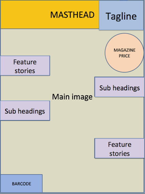
Typical Magazine Cover Layout
In a typical magazine cover the mast head is placed at the
top of the magazine. This makes it stand out as this is the first place you
would typically look at. In the middle you would have a main image, typically a
model. This makes the magazine look more interesting and visually more
appealing. The main image is normally a mid shot as this shows off the model,
and makes the model stand out which is what draws the reader in. around the
edge of the magazine you would find your sub headings. These let the readers know
what’s inside the magazine. Depending on the tag line the writing will normally
be different sizes as this makes the more important one stand out and draws the
reader in. This will normally be about a famous person. The barcode is located
at the bottom typically in the corner. This is so that the consumer is able to
buy the product and it is usually small so as not to take up too much space.

No comments:
Post a Comment